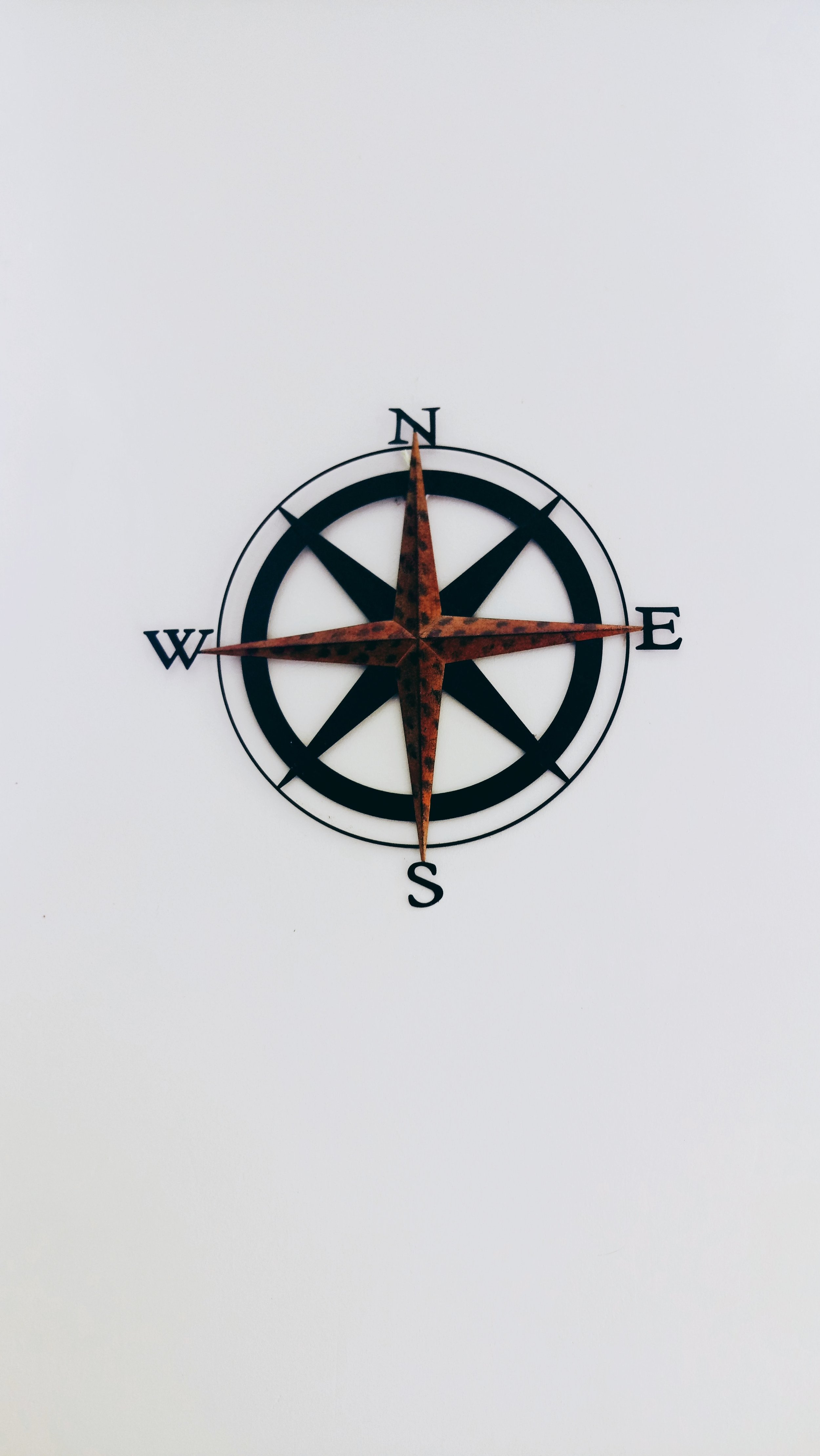
Project Compass
Role
UI/UX Design
Team Members
Tools
Figma
Product Leads/Managers: Niko Booth, MaoMei, Janice Tam
UX/UI Designers: Neha Agarwal, Miguel Hugo, Tyler Matsunami, Yurik Riegel, Cory Ishii, Trish Lee, Lavina Green, Bruna Lee, Seung Yoo
Engineers/Developers: Anup, Tessa Thornberry, Hieu Ngo, Hannah McGowan, Jonah Choi, Josh Jay, Brett Eastman, Patrick Choi, John Dunning, Kelly Shao, Max Isom, James Schweig
Compass is a web-based app focused on designing applications to help Case Managers and Paras facilitate timely and reliable data collection for students’ yearly IEP goals. Enable delegation of data collection to staff (paras), as well as centralizing student data in one place for Case Managers to make informed decisions about student progress.
Duration
September 2022-
Just started
I came into the project during the Research stage. The team directed me towards the info guide.
I was having a hard time coming up with proper questions during the interviews.
Mood Board
Logo
The logo was custom created to resemble a “C” with rounded edges.
The middle of the “C” is supposed represent a compass needle, & a pencil on the other to represent education.
Typeface: Quicksand SemiBold
We felt that the Quicksand typeface best matched the logo’s typography.
Color Palette
The project lead requested that we use a calming color. In addition of not involving orange or gold.
The palette is based on an experimentation between bluish & purple hues.
Though finding complimentary, accent colors proved to be difficult.
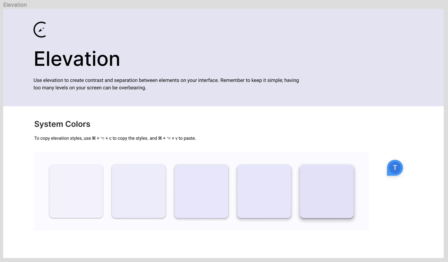
Design System
Styles
We researched styles that best matched educational apps.
It was challenging to choose a versatile typeface that could show contrast. We went with Quicksand as the primary typeface, & Inter as the secondary.
We wanted to choose icons with similar stroke width.
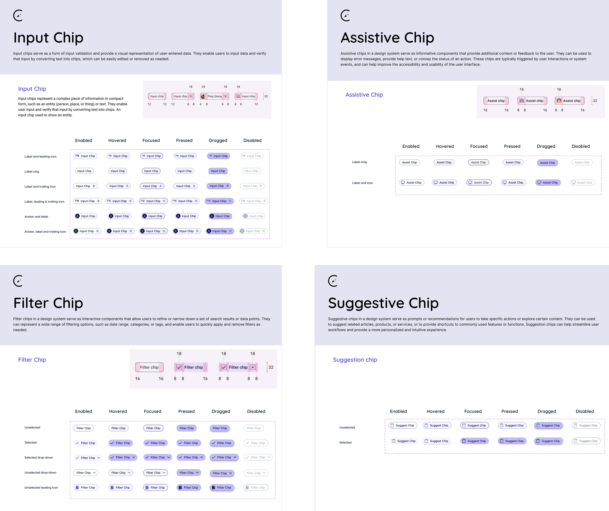
Design System
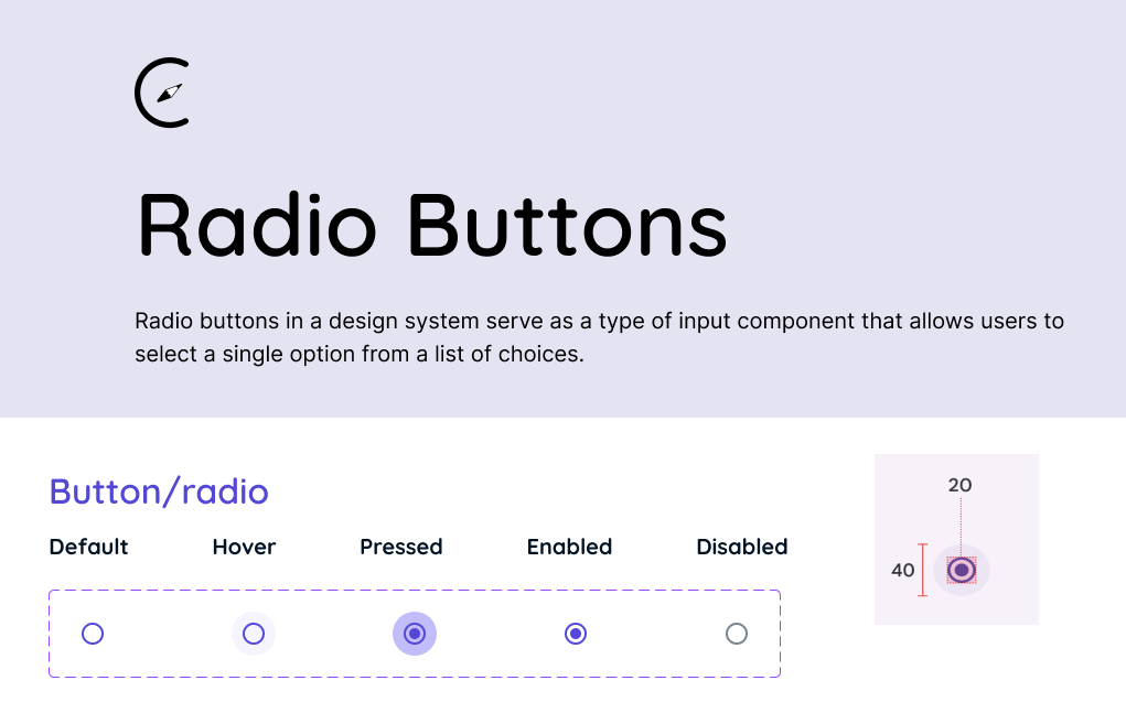
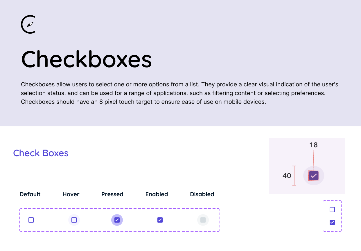
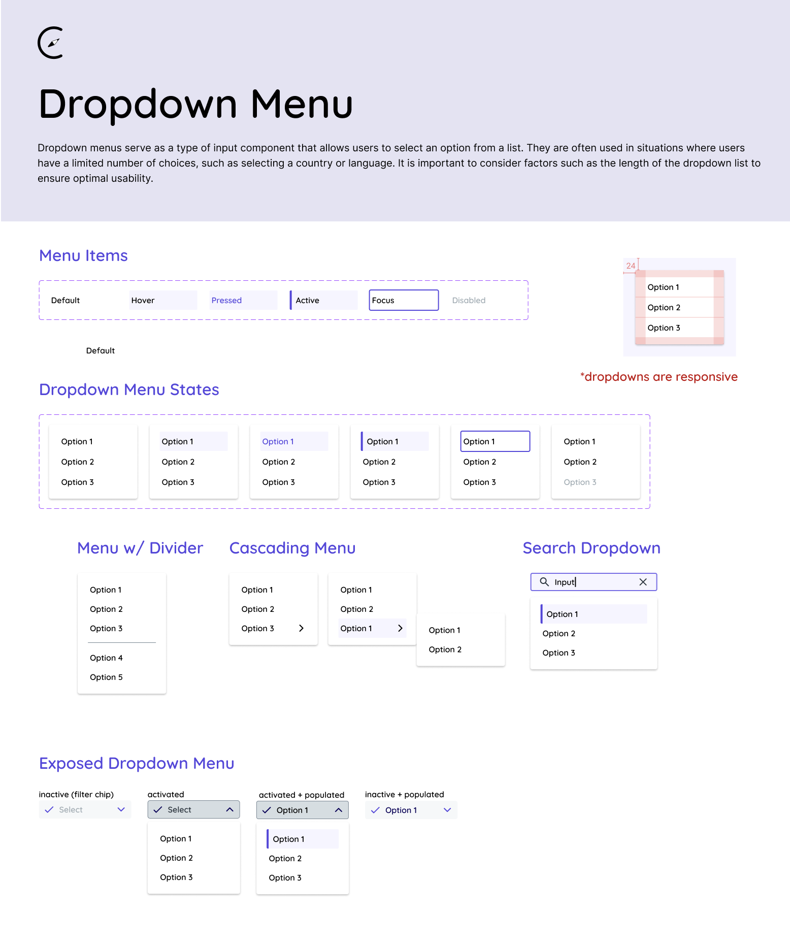
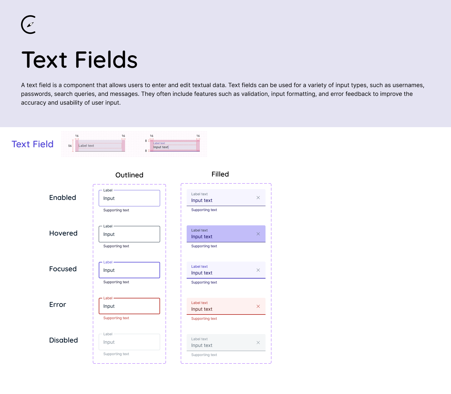
Input Controls
Design System
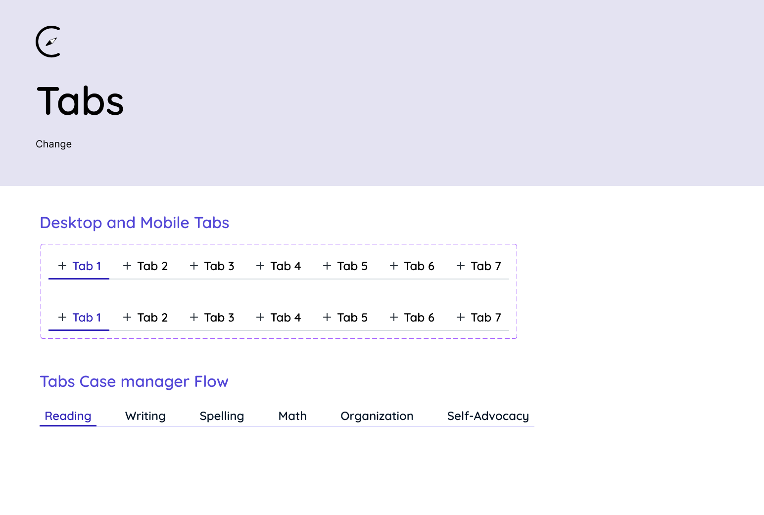
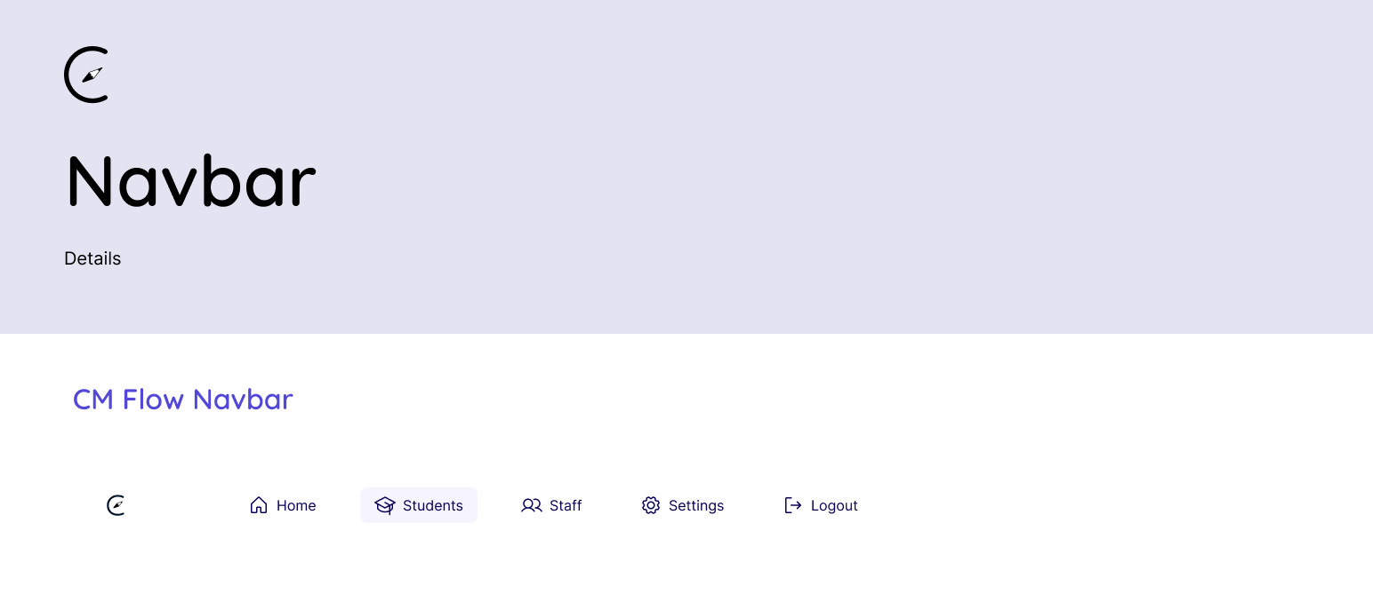
Navigation
Design System
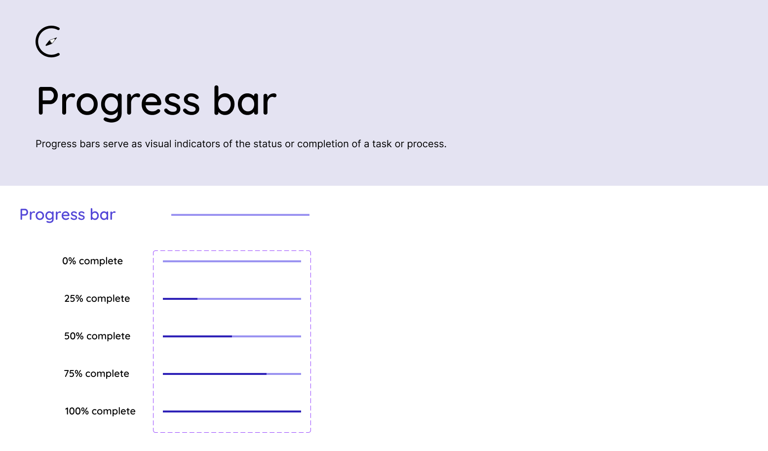
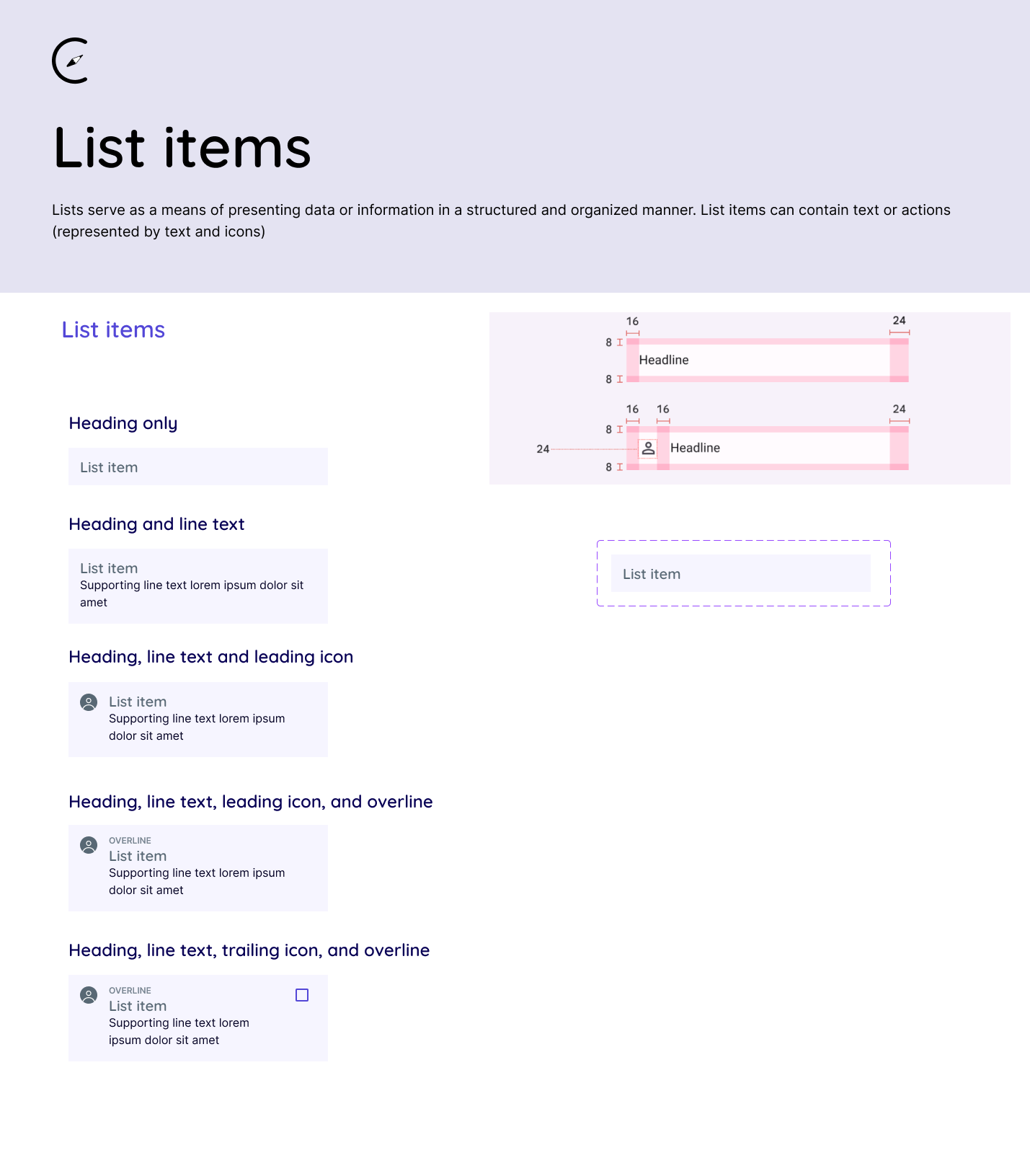
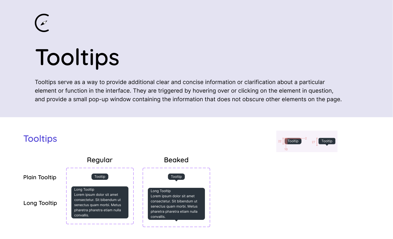
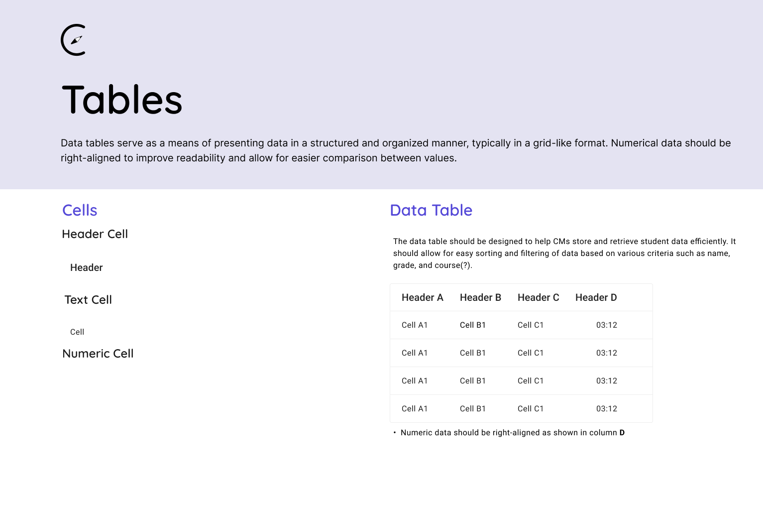
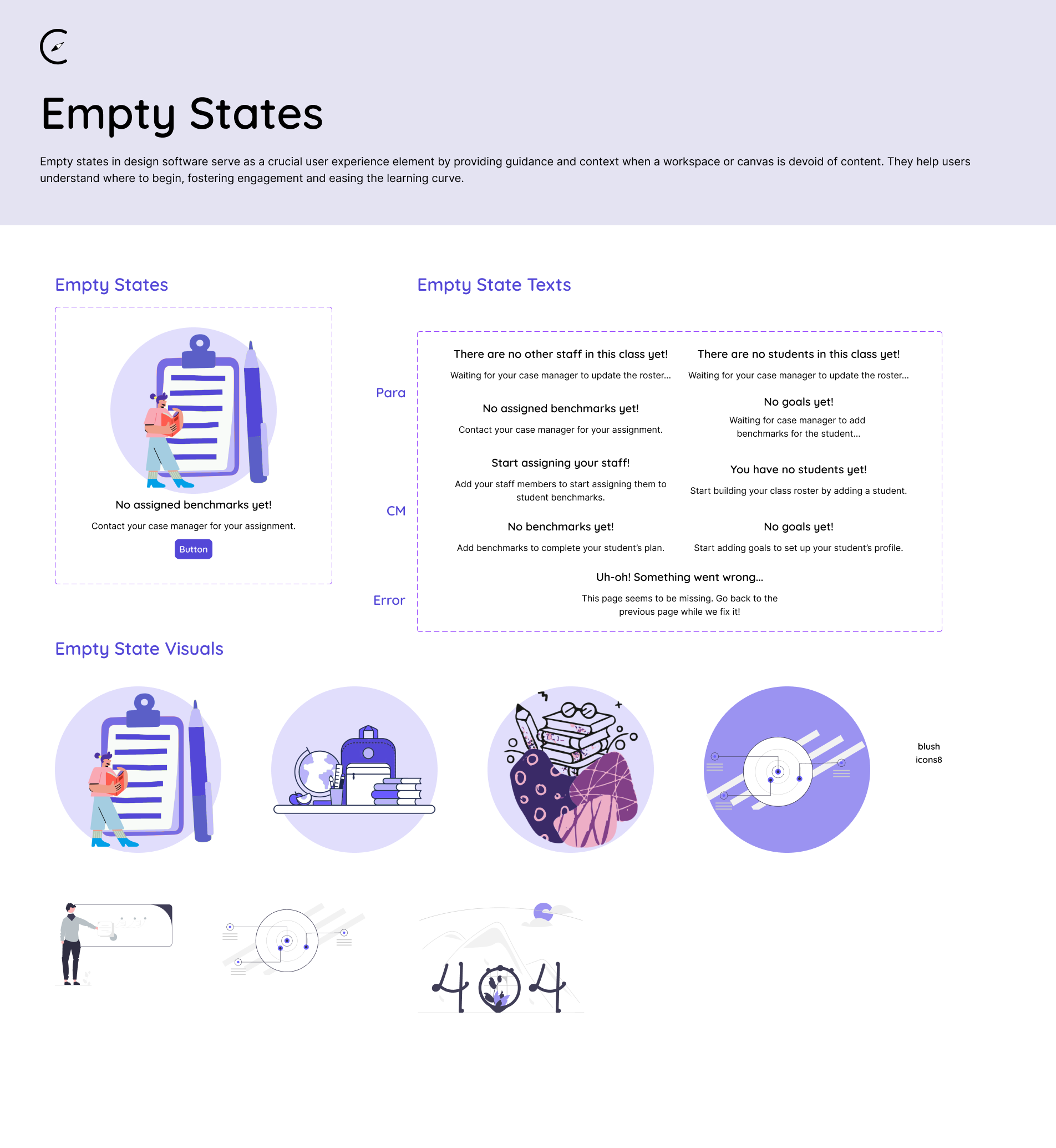
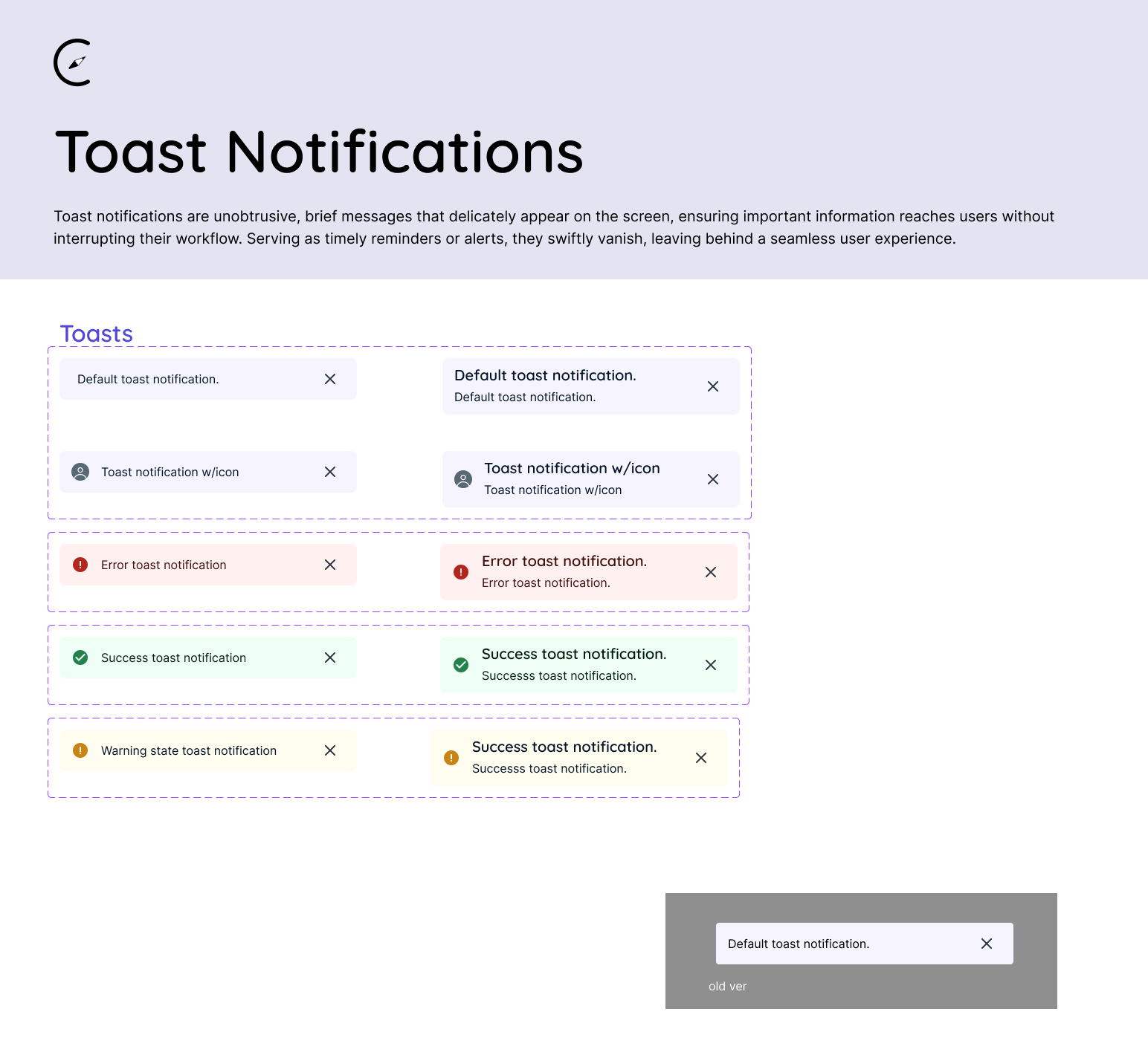
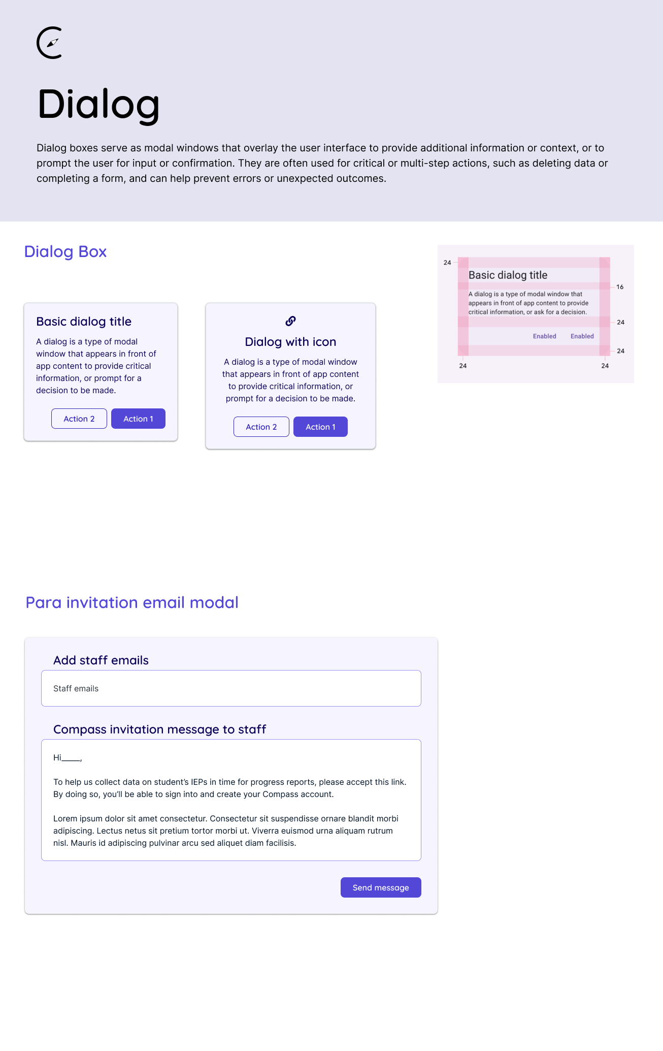
Information
Design System
Patterns
Flows
More to come..
This case study is ongoing, & will be updated.


