John Muir’s MyChart
Has made connecting patients with their primary care providers more convenient than previously. When a new symptom occurs, or a medical question needs to be answered, but it may not be necessary to schedule an appointment, MyChart helps remedy that. Don’t worry about sounding professional. Sound like you. There are over 1.5 billion websites out there, but your story is what’s going to separate this one from the rest. If you read the words back and don’t hear your own voice in your head, that’s a good sign you still have more work to do.
Role
Branding, UI design, graphic design, user research, UX Design
Tools
Figma, Adobe Illustrator, Adobe Photoshop
Duration
Feb 2025-Present
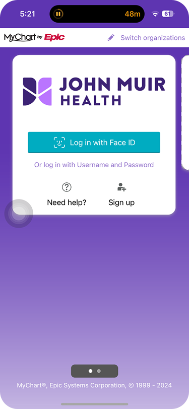
Log-in
-MyChart’s current log-in page for new users require you to put in your healthcare provider’s association.
-Some users will have iOS’s FaceID to help speed up the log-in process
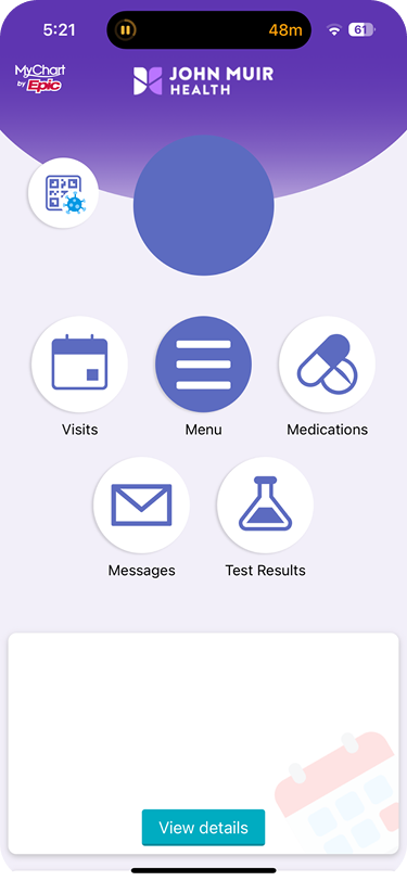
-Their dashboard is simple, & easy to understand. The card at the bottom is for appointment reminders & the details that follow.
-Their design team was able to update the main dashboard, the design is more sleek, and more modern.
However..
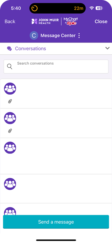
After tapping on the messages icon, it takes the user to their inbox.
Then taping on the “send message” CTA, it leads you to their main dashboard.
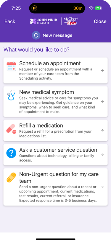
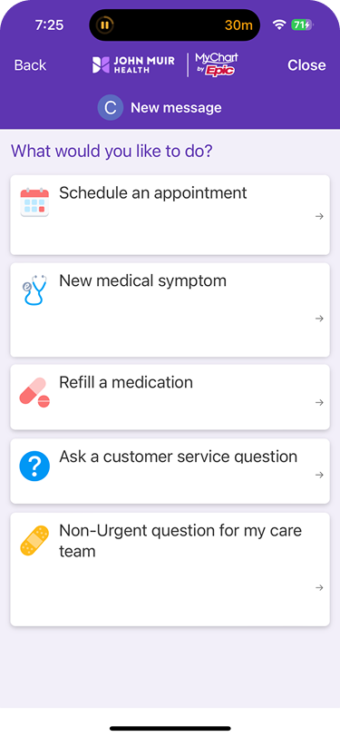
When a user wants to message their doctor (as would most). Their dashboard resembles this..
Most users will probably not see issues. Though there are some.
—>
—>
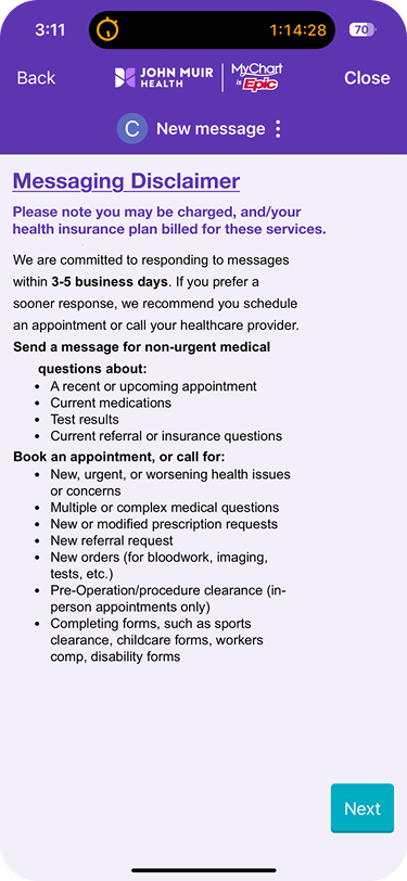
My first attempt was to get rid of the excess body text & leave the headers.
The result was the cards looked too big & didn’t provide enough context.
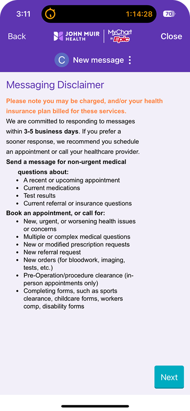
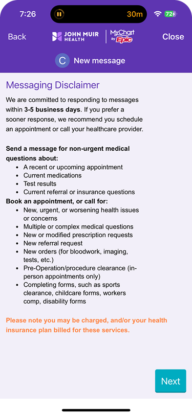
This disclaimer about being charged to the patient’s insurance was moved.
Though the same issue of the unrelated color & random white line remained.
—>
—>
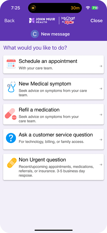
My latest attempt put back the text, but shortened them to state keywords.
The result was a more balanced, modern look that was less text heavy.
My version includes making the heading bolder & underlined.
As well as utilizing an existing text color for the disclaimer. & deleting the line.
Screen Issue 1
First, the cards have too many words for comfort.
Second, the unnecessary white line, that looks unrelated to the cards listed.
Screen Issue 2
MyChart made some improvements that well along with the app’s updates.
Though the reasons for some of the improvements are varied.

