Marugame Udon
The year was 2000, when Mr. Takaya Awata started Marugame Udon in Japan. It’s famously called the “Udon King of Japan”, Marugame has been synonymous with fast, easy, great quality Japanese fast food. Their famously authentic udon noodle soups (Sanuki udon) & tempura are made fresh daily with 100% domestic wheat flour, with the dish’s varieties to satisfy everyone’s palette. They’re also known for creating their famous dishes in an open kitchen, so customers can see their creations in real time. Their Gyudon (thinly sliced beef marinated in a sweet soy sauce with onions, served over steamed rice) is another popular hit among many customers. Though by in large, their udon are their best sellers.
Role
Branding, UI design, graphic design, user research, UX Design
Tools
Figma, Adobe Illustrator, Adobe Photoshop
Duration
Feb 2025-Present
App functionality issues
Non Member Log-in
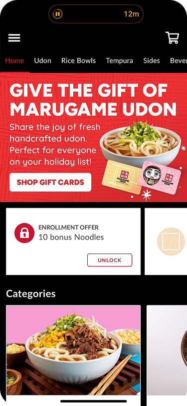
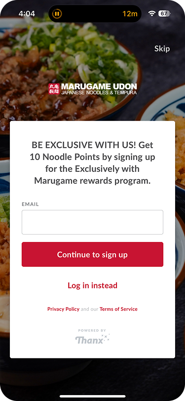
-Marugame Udon’s app seemed pretty straight-forward, at first glance.
-One thing to note was that there was no onboarding after the user launched the app. Even after rebooting the app.
-The app prompts you to sign-into your account, using your email.
-However, users can choose to skip signing up, & will take the user to its home page.
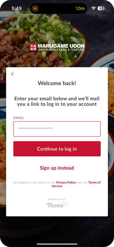
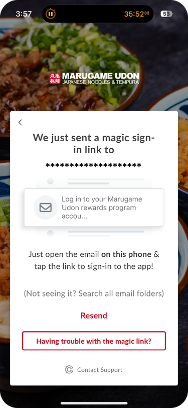
Verification Email
Users who recently signed up for Marugame Rewards Program or account will try to access theirs.
After signing up, the app sends a verification email to verify their account. Simple!
It should be noted that there are ‘resend’ & ‘having trouble with the magic link?’ CTA’s, which are nice.
Verification email not working.
What’s heartbreaking to see is email verification’s not being utilized correctly.
I resent the code to my email, & was met with this exact same user flow.
The verification link didn’t work. Which is weird. I thought the link was bad so I refreshed it.
I even did a command, reset (command + shift “R”) to reload the page & found this.
Contacting Support
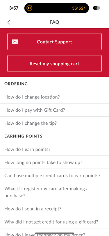
A user having trouble getting an account would try to find a way to access their account.
There were 2 options, contact support, & resetting the shopping cart.
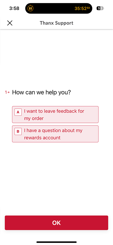
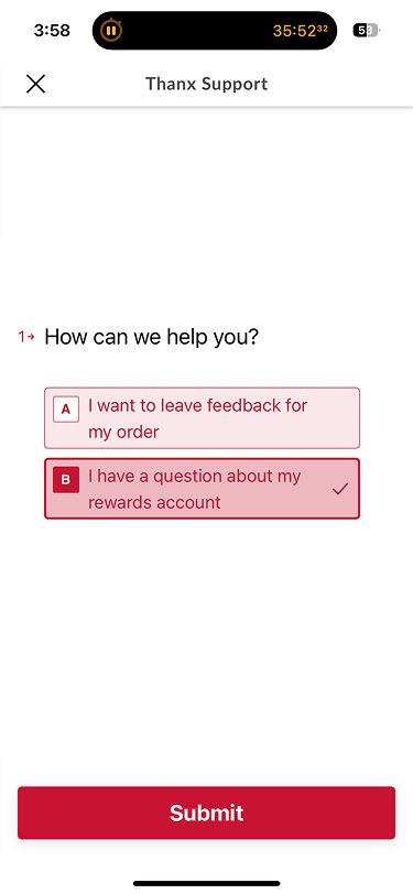
When the user contacts support, there are 2 options, leaving feedback on an order or having questions about the rewards account.
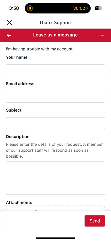
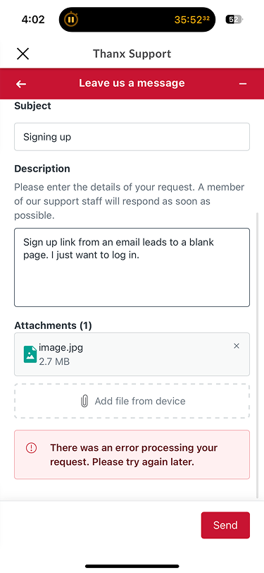
Their message, a classic form for users to put in their email, message subject, description, & attachments drop-down, all straight-forward.
What’s considered a pain-point is when taping the "send” CTA, an error pops up.
When the user contacts support, there are 2 options, leaving feedback on an order or having questions about the rewards account.
—>
—>
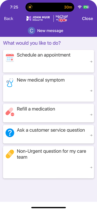
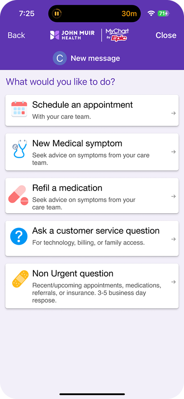
My first attempt was to get rid of the excess body text & leave the headers.
The result was the cards looked too big & didn’t provide enough context.
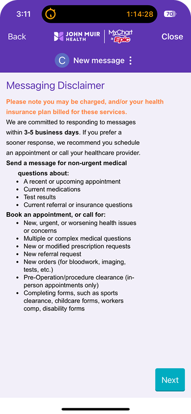
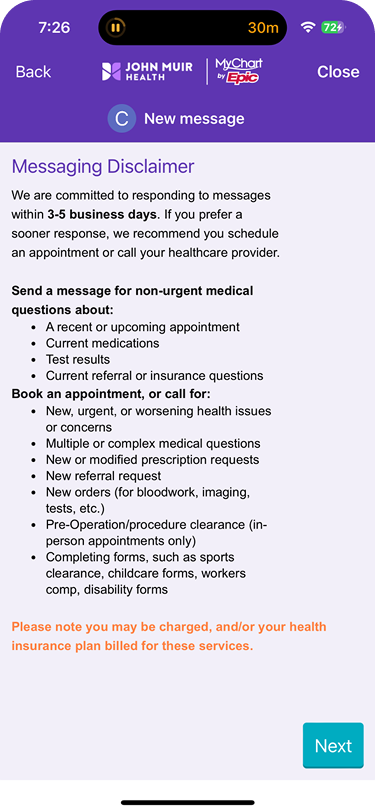
This disclaimer about being charged to the patient’s insurance was moved.
Though the same issue of the unrelated color & random white line remained.
—>
—>
My latest attempt put back the text, but shortened them to state keywords.
The result was a more balanced, modern look that was less text heavy.
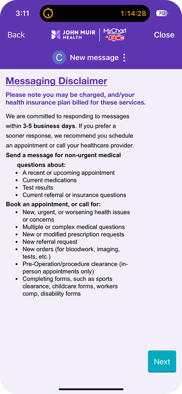
My version includes making the heading bolder & underlined.
As well as utilizing an existing text color for the disclaimer. & deleting the line.
My Solutions
Proper Onboarding User Flow
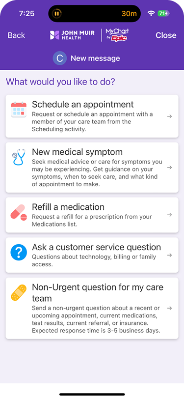
First, the cards have too many words for comfort.
Second, the unnecessary white line, that looks unrelated to the cards listed.
MyChart made some improvements that well along with the app’s updates.
Though the reasons for some of the improvements are varied.
—>
—>
My first attempt was to get rid of the excess body text & leave the headers.
The result was the cards looked too big & didn’t provide enough context.
This disclaimer about being charged to the patient’s insurance was moved.
Though the same issue of the unrelated color & random white line remained.
—>
—>
My latest attempt put back the text, but shortened them to state keywords.
The result was a more balanced, modern look that was less text heavy.
My version includes making the heading bolder & underlined.
As well as utilizing an existing text color for the disclaimer. & deleting the line.
My Solutions
Properly verifying an email
First, the cards have too many words for comfort.
Second, the unnecessary white line, that looks unrelated to the cards listed.
MyChart made some improvements that well along with the app’s updates.
Though the reasons for some of the improvements are varied.
Sources
Marugame Udon: Largest Japanese Udon Chain -Frame 6 -3
https://www.westfield.com/en/united-states/utc/restaurants -Frame 8 (pink background)
Marugame Udon Nikutama -Frame 8 (pink background)
Marugame Udon Trip Advisor -Frame 6 -2


